Robin Williams Tribute Article
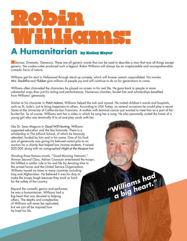
This design was published in Oz Magazine's October/November issue. The article commemorates Robin Williams' humanitarian work. The design was purposefully kept light and happy to remember Williams' undeniably caring heart.

Year of Arabian Peninsula Logo
This logo design is for Kennesaw State University’s Year of program, 2014 - 2015 academic year.
The logo focuses on the trade aspect of the Arabian Peninsula, and the fact that the region has been a trade hub for thousands of years. A skyline is silhouetted against the sails of an Arabian ship, tying ancient trade together with modern innovation.

2014 AIGA Portfolio Day Poster
Created under a very tight schedule, this poster advertises the event that I chaired. The background and text boxes use 100% CMY color, to allude to four process color. Designs were created in compliance with AIGA web graphics standards.

2014 AIGA Portfolio Day Web Graphic
This design was part of the 2014 AIGA Portfolio Day's brand. This particular piece is part of the web graphics that went up on the AIGA Atlanta website as headers for the event.

Nutrigrain Package Design
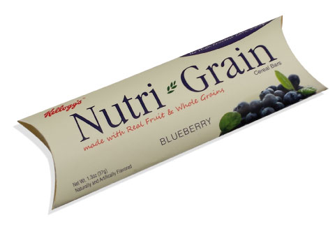
This package design takes Nutri Grain and gives it a new, healthier looking, and environmentally friendly package. The package has been completely changed from the original plastic wrapper. In order to be more environmentally conscious, the package is a cardboard box with a waxed paper inner wrapper, in order to preserve freshness. The box also has a second function. A Nutri Grain bar is the ultimate on the go snack, something someone keeps around for when they need a quick bite. With this in mind, the box is quite functional. It can protect the bar better than the bar’s traditional wrapper. With an easy to open coinpurse style design, the box is tough and ensures that the consumer can put their bar in a bag and it won’t get crushed.

Nutrigrain Advertisement
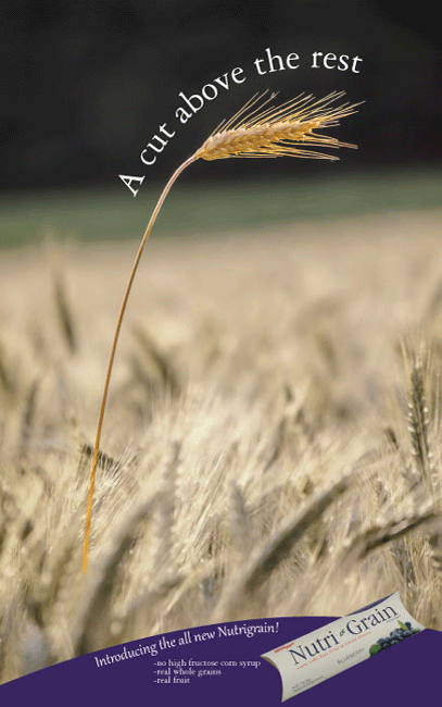
This ad for this new Nutrigrain package features the wholesome grains of Nutri Grain, and shows the consumer that Nutri Grain is better than the competition. In creating this ad, I desaturated the photo, except for the exceptional piece of wheat, which I added more yellow to. The result is a golden stalk of wheat rising above the other, more plain stalks in the field.
The bottom of the ad features the new package, as well as the key facts that Nutri Grain prides themselves on.

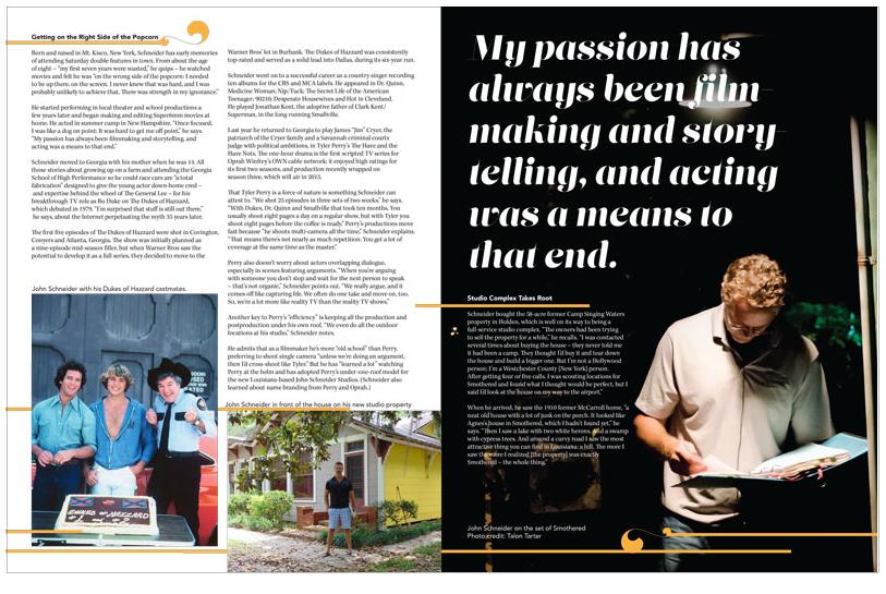
Featured Article pg1
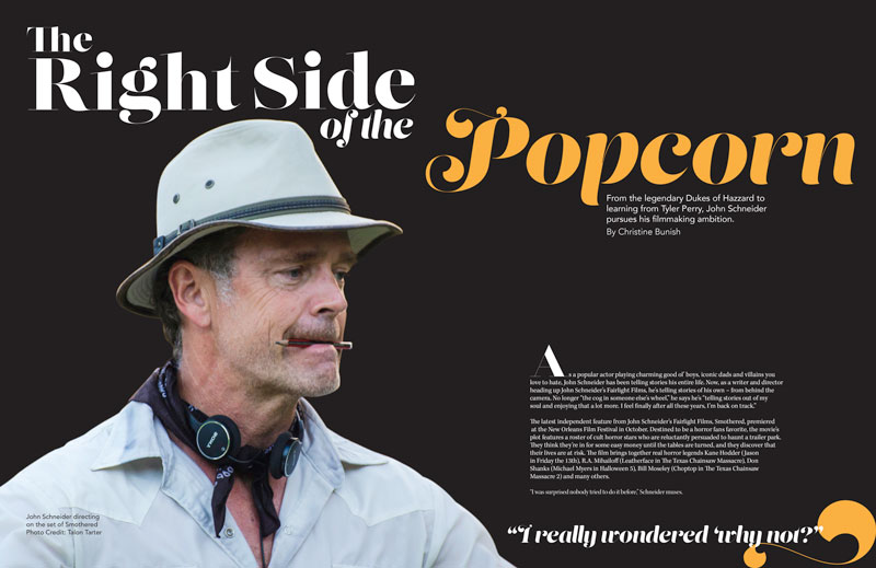
This was the preliminary design for the featured article for Oz Magazine's January/February 2015 issue. This is the first spread.

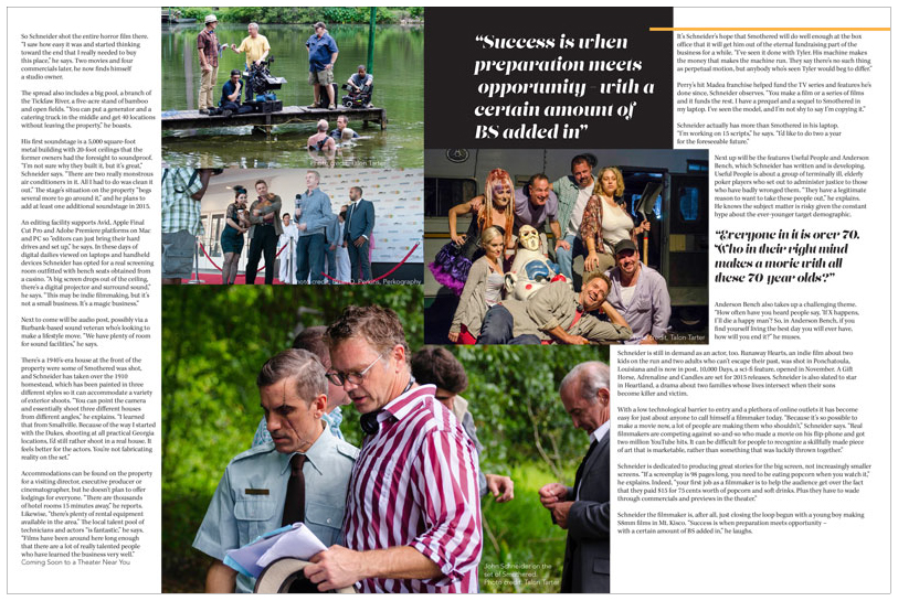
Featured Article pg2
This is the second spread for the featured article for Oz Magazine's January/February 2015 issue.

Featured Article pg3
Here is the final second spread for the featured article for Oz Magazine's January/February 2015 issue.

Props Ads
This prospective advertisement was created to be printed in the 2015 Georgia Film & Television Sourcebook. I chose colors and a layout based on the other ads in the sourcebook- I wanted the ad to stand out in comparison to the other ads in the book. Images featured in the ad are from the client's many offerings of props from their website, and emphasize the large selection of props as well as the client's talent in getting each prop to work. The ad was also an exercise in branding.

This second ad is a companion piece to the previous ad; it is a web banner for RJR props' web listing.

Voices Article
This was the preliminary design for Oz Magazine's Voices article for their January/February issue. Geometric shapes tie in with the Robin Williams article, in order to provide a sense of brand consistency.

Industry Yearbook Ads
The next three ads are a three-fold campaign advertising Oz Publishing's Industry Yearbook, a book covering 40 years of Georgia Filmmaking and the people who made it happen. Each ad includes an image of the yearbook, as well as select pages from it to give the viewer an idea of what the book entails. This particular ad is a full page ad for Oz Magazine.

This is the next in the series for Oz Publishing's ad campaign for the Industry Yearbook. This is a half page ad set to run in Oz Magazine.

This final piece is a web banner that was created for Oz Publishing to advertise the Industry Yearbook on their website.

Thank You Postcards
This Thank You was designed for Oz Publishing. The versatile design allows the client to print the design on either the front of a postcard, or as the front of a blank folding card. The design uses the company's favored teal brand color, as well as Oz's lettermark logo as a watermark at the bottom.
